
Local delivery
starting at $79.00
starting at $79.00
starting at $79.00
starting at $79.00

Wood tones blend best using the rule of three: choose three distinct shades, light, medium, and dark, distributed throughout the room, anchoring pieces like a coffee table. Use a cedar chest as a focal point while coordinating pine furniture and existing wood trim around windows and doors for balance.
Successful wood-tone mixing pairs one dominant tone, like clear stained pine, with two supporting shades, avoiding a strict 50/50 split. Anchor the room with a large piece such as a coffee table, then repeat undertones in smaller accents. Heirloom pieces, like a distinctive cedar chest, work as intentional focal contrasts rather than problems to hide.
Mixing wood tones requires a clear understanding of the existing pieces in a room. A willingness to break away from matching furniture sets. Many homeowners shy away from this approach when redesigning a space, fearing clashing finishes. The reality is that using only one wood tone throughout an entire room makes the design fall apart, lacking the dimension that layered materials provide.
The most common error is attempting to match every wood surface perfectly. This creates a apartment, catalog-like appearance that removes personality from a space. Today's hardwood furniture emphasizes sustainability and versatility, not uniformity. People now create rooms by mixing their own tastes, ensuring that no home looks identical to another. A room filled with identical wood finishes feels static rather than curated.
Before adding new pieces, homeowners must assess the undertones of their current furniture. Warm woods carry red, orange, or yellow hues. Cool woods lean toward gray, white, or blue. Neutral woods sit in the middle. Identifying these undertones prevents accidental clashes. A piece with warm red undertones will fight against a cool gray-washed table in the same sightline. Grouping furniture by undertone family creates a cohesive foundation before introducing contrast.
|
Undertone Type |
Common Wood Examples |
Best Pairing Strategy |
|---|---|---|
|
Warm |
Cherry, Mahogany, Pine |
Pair with other warm woods or neutral tones |
|
Cool |
Ash, Maple, White Oak |
Pair with other cool woods or neutral tones |
|
Neutral |
Walnut, Teak, Bamboo |
Bridges warm and cool finishes effectively |
A homeowner should gather three to five existing pieces and hold them side by side in natural light. This simple exercise reveals which undertones dominate the collection. Once the dominant undertone is clear, selecting new Living Room Furniture becomes a matter of intentional contrast rather than guesswork. The goal is balance, not uniformity.
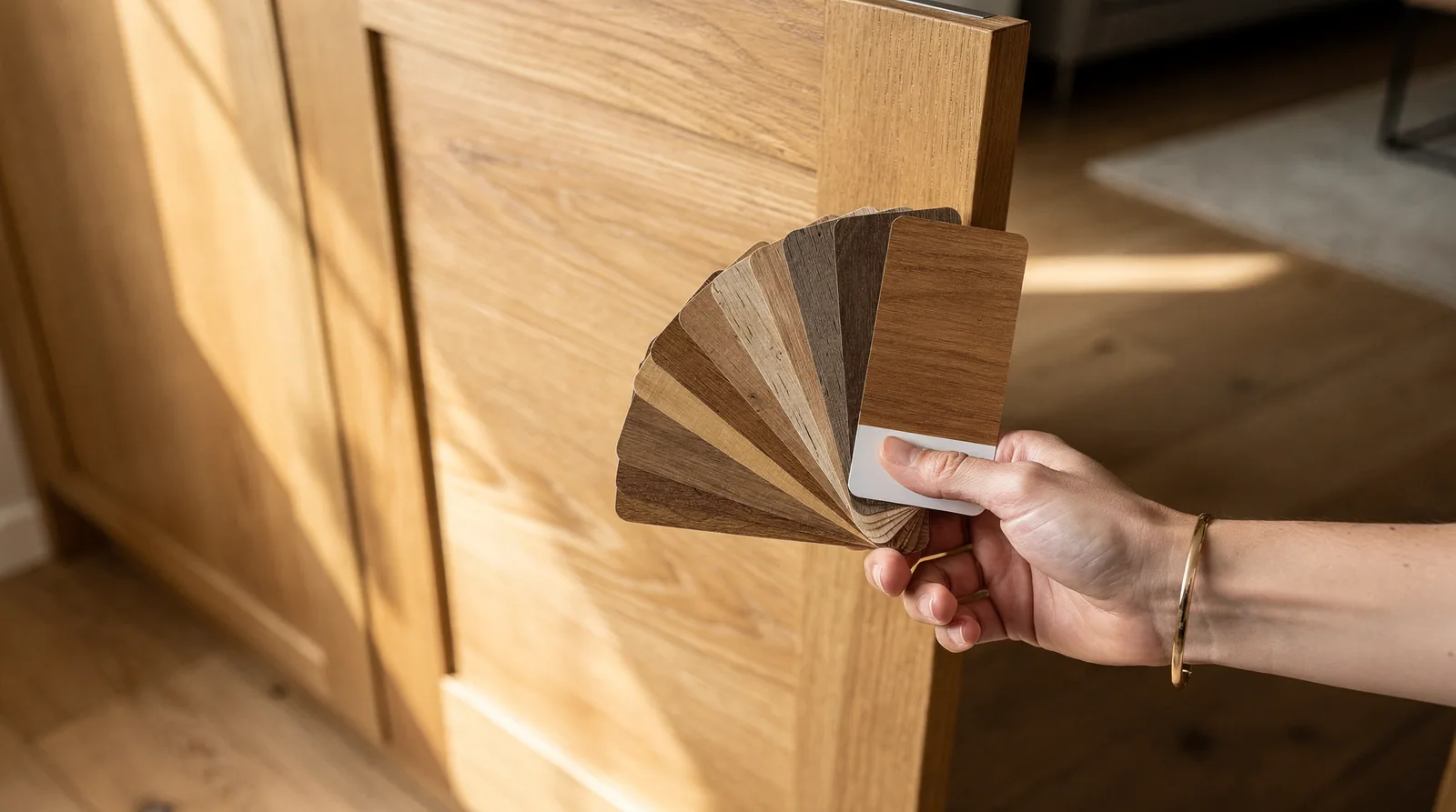
Identifying existing wood tones starts with looking beyond color alone. A homeowner moving into a new house faced this exact challenge, needing to integrate clear stained pine furniture and an heirloom cedar chest while also accounting for wood trim on windows and doors. Before buying anything new, any homeowner must catalog what is already in the space. The goal is not to match pieces exactly but to understand the family each belongs to. Failing to identify undertones leads to clashes that make a room feel disjointed. Visually chaotic, undermining months of careful planning.
The visible grain pattern acts as a fingerprint for wood species. Pine, for example, features prominent, widely spaced grain lines and a yellow-to-orange undertone. Oak shows a more dramatic, cathedral-like arch. A cedar chest has tight, uniform grain with reddish-purple streaks. Noticing these patterns clarifies which woods share a natural kinship. Grouping furniture by grain style simplifies the process of layering contrasting tones later.
Creating a portable swatch solves the problem of buying furniture sight unseen. Take a clear photograph of each piece in natural daylight, then print the images on matte photo paper. Cut the images into small rectangles and punch a hole in one corner. Thread them onto a key ring to create a durable set of references. This physical swatch travels to furniture stores or sits beside a laptop during online searches. One homeowner envisioned making exactly this kind of wood swatch to carry around, revealing how practical this approach is for making confident pairing decisions at retail locations.
|
Wood Type |
Undertone |
Grain Characteristic |
Swatch Indicator |
|---|---|---|---|
|
Pine |
Warm yellow-orange |
Wide, loose grain lines |
Darkens with age to deeper gold |
|
Cedar |
Warm reddish-purple |
Tight, straight grain |
Distinctive aromatic scent |
|
Oak |
Tan/pink |
Cathedral arch patterns |
Strong texture visible |
Use these steps to document every wood surface in the room:
Photograph each piece under natural daylight, avoiding direct sunlight.
Print samples on matte paper at actual size for accurate scale reference.
Label each sample with the wood type, finish (e.g., clear stain), and room location.
Note adjacent surfaces like window trim, flooring, and door frames.
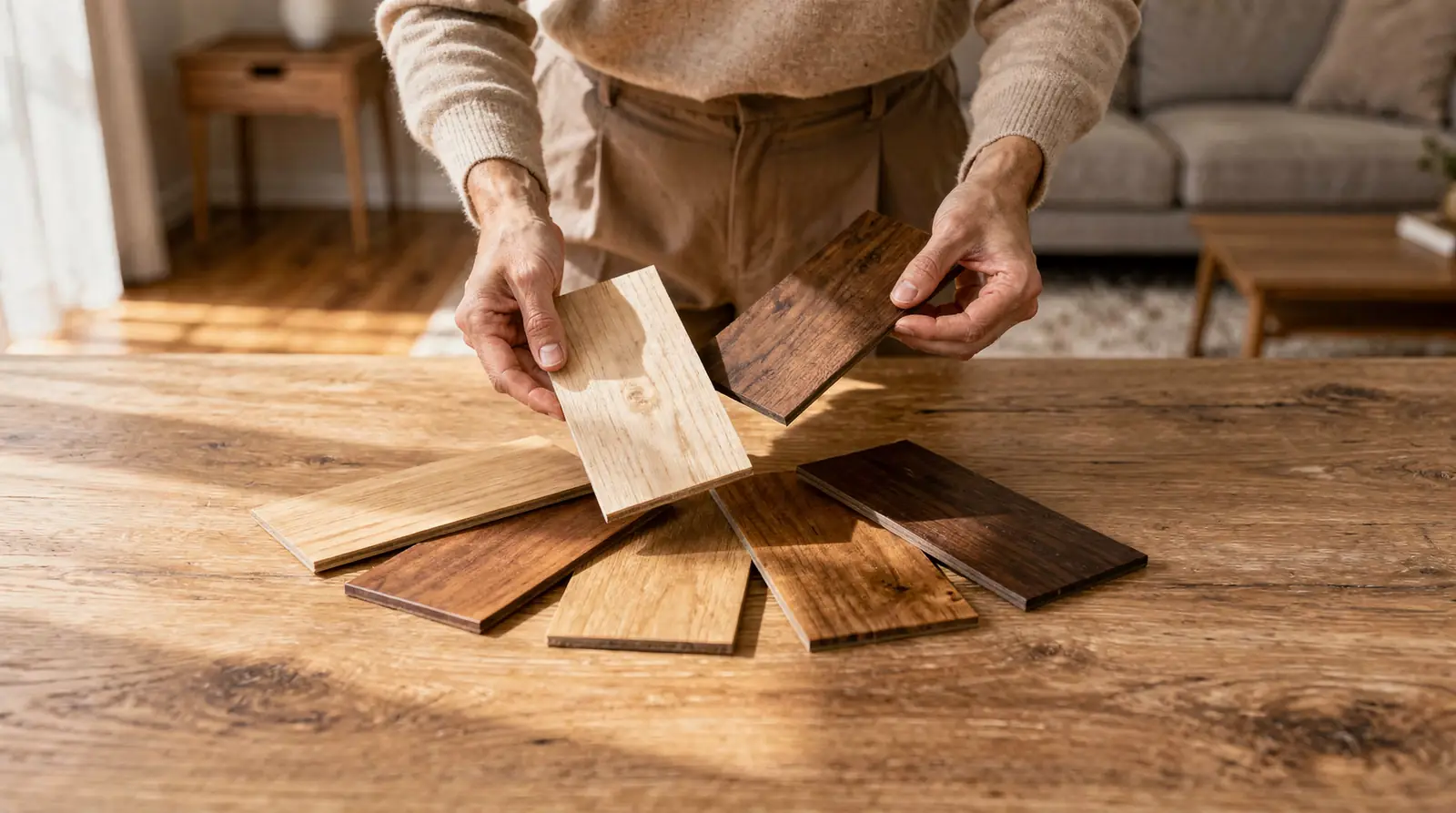
The first step to mixing wood tones is identifying a dominant wood tone to anchor the room. A coffee table in a dark wood shade can be paired with a bench in a lighter wood. Only when one tone clearly leads the composition. Without this anchor, the space risks visual chaos rather than intentional layering.
The perfect mix of wood tones can make all the difference in a home's design. However, creating a balanced look with mixed wood tones can be easier said than done. The design team often receives questions asking for guidance on how to mix-and-match wood tones without clashing or without being too matchy-matchy. The answer starts with a single decision: choose the hero piece.
The dominant wood tone should come from the largest or most visually prominent piece of Living Room Furniture in the space. A substantial media console, a large dining table, or an heirloom cedar chest naturally draws the eye first. That piece sets the color temperature and grain direction for everything else. Every additional wood element then relates back to this anchor, creating a cohesive foundation before any mixing begins.
When no single piece dominates, the homeowner risks a scattered look where no wood tone feels intentional. The solution involves selecting the piece with the most visual weight, typically the largest surface area or the darkest stain. That piece becomes the reference point. All lighter or contrasting woods then serve as accents rather than competitors. This approach prevents the clashing that makes mixed wood tones feel accidental rather than designed.
Choosing a dominant wood tone starts with identifying the largest fixed wood surface in the room. That piece, whether it is flooring, built-in shelving, or a substantial dining table, sets the visual anchor. Wood is making a comeback in home décor, with options ranging from modern pieces with clean lines to raw, untouched pieces that showcase natural grain. When choosing the right wood furniture, the options can feel overwhelming. But a single anchor piece eliminates the guesswork.
The dominant wood tone is the one that covers the most visual surface area in the room. Flooring is the most common anchor because it spans the entire space. If the floors are a medium oak, that tone becomes the baseline. Every other wood piece in the room relates back to that foundation. A large media console or a substantial dining table can also serve as the anchor if the floors are neutral or covered.
Once the anchor is set, the rest of the Living Room Furniture becomes easier to layer. Gone are the days of matching bedroom sets. Living room pieces that feel like they popped out of a furniture catalog. Instead, more people are picking up pieces along the way, mixing tones and colors to create a unique look. The anchor provides a reference point. A client can add a walnut coffee table next to oak floors because the anchor establishes the range. The goal is contrast, not duplication. A room with one dominant tone and two to three supporting tones feels intentional rather than chaotic.
Layering a secondary wood tone starts with identifying the dominant wood in the room. Select a second tone that contrasts rather than competes. A homeowner with no design background can still master this process by treating wood tones like a color palette. The goal is to create visual depth without creating visual chaos.
A reader with no design or art background recently asked how to identify a piece of furniture that might go well with existing pieces. The reader wanted to add new furniture to the home and try mixing wood tones. The reader's specific challenge involved a clear stained pine furniture set and a distinctive cedar chest. Pine should be easy to match with other things, but the cedar chest is pretty distinctive and requires careful consideration.
The simplest method involves creating a physical wood swatch. Take a small piece of the existing furniture, or a photo printed at actual size. And compare it against potential new pieces. For online shopping, photograph the swatch next to a neutral object like a white sheet of paper to capture the true undertone.
Three rules for selecting a secondary wood tone:
Choose a tone one step lighter or darker than the dominant wood. A medium pine pairs well with a light oak or a dark walnut, but not with another medium wood that shares the same orange undertone.
Match the undertone, not the color. Warm woods (red, orange, yellow) layer with other warm woods. Cool woods (gray, taupe, ash) layer with other cool woods. Mixing warm and cool undertones creates the clash most homeowners fear.
Use the 60-30-10 ratio. The dominant wood tone covers a notable share of the room (flooring, largest furniture piece). The secondary tone covers a notable share (coffee table, sideboard). A third accent tone covers a notable share (small side table, picture frame).
A homeowner who ignores undertones ends up with a room that feels disjointed. The cedar chest with its rich red-brown hue will fight against a pine piece with yellow-orange undertones. The result is a space that looks unintentional rather than curated. The reader's instinct was correct: pine is flexible, but the cedar chest demands a secondary tone that acknowledges its strong red pigment. A dark walnut or a black-stained piece would anchor the chest without competing.
An accent wood tone introduces contrast without overwhelming a room. Designers often receive questions about mixing wood finishes without creating a cluttered or mismatched appearance. A single accent piece, such as a side table or a picture frame, can anchor a seating area and break up monotony. This approach works because the eye naturally gravitates toward the unexpected element, making the space feel curated rather than chaotic.
An accent wood tone occupies less visual surface area than the primary wood pieces in a room. A small console table in a warm walnut finish against a floor of light oak serves as an accent. The key lies in proportion: the accent piece should cover no more than 20%- a notable share of the visible wood surface in the space. This ratio prevents the accent from competing with the dominant furniture.
Positioning an accent piece near a neutral anchor, like a white wall or a solid-colored sofa, maximizes its effect. Placing a dark cedar chest next to a light pine coffee table creates a deliberate focal point. The contrast draws the eye and gives the room depth. Avoid clustering multiple accent tones together, as this dilutes their individual impact and can create visual noise.
Steps to introduce an accent wood tone effectively:
Identify the dominant wood tone in the room, such as the floor or largest furniture piece.
Select one contrasting accent tone that differs in either color (warm vs. cool) or grain (open vs. tight).
Place the accent piece at least 3-4 feet away from the dominant wood to allow the eye to register the difference.
Limit accent pieces to one or two per room to maintain a balanced, intentional look.
Creating a balanced look with mixed wood tones can be easier said than done. Many homeowners shy away from this design challenge. The perfect mix of wood tones can make all the difference in a home's design. A single accent piece, used correctly, transforms a safe room into a sophisticated one.
Balancing warm and cool wood tones starts with identifying the undertone of each piece rather than its surface color. A warm-toned oak table carries golden or red hues, while a cool-toned ash or maple piece leans gray or ashy. The goal is contrast with intention, not accidental clashing.
Today's hardwood furniture is all about sustainability and versatility, which makes mixing tones easier than ever. Wood is making a comeback in home décor, with options ranging from modern pieces with unique designs to raw, untouched pieces that show the grain. Instead of buying furniture all at once, more people are picking up pieces along the way, mixing tones and colors to create a unique look. People are creating rooms by mixing their own tastes, ensuring that no home is alike.
Hold a piece of white paper next to the wood. Warm woods reflect yellow, orange, or red onto the paper, while cool woods reflect gray, green, or blue. This simple test works on finished and unfinished surfaces alike.
The 60-30-10 rule keeps the balance predictable. Assign roughly a notable share of the room's wood to one dominant tone, a notable share to a secondary tone, and a notable share to an accent piece. This approach prevents any single item from feeling out of place.
A practical sequence helps homeowners layer tones without overwhelm:
Select a dominant tone for the largest piece, such as a sofa frame or media console.
Choose a secondary tone that contrasts in temperature, pairing a warm walnut with a cool ash.
Add an accent piece in a third tone, like a small side table, to tie the scheme together.
Evaluate the mix under natural light, since warm and cool undertones shift dramatically from morning to evening.
Matching sets no longer define a well-designed room. A thoughtful blend of warm and cool tones creates depth. That depth makes the space feel collected rather than catalog-ordered.
Mixing wood tones transforms a space. Most homeowners make three critical errors that leave rooms feeling disjointed rather than curated. The biggest mistake remains sticking to a single wood tone throughout an entire Living Room Furniture arrangement. Using only one wood tone makes the design fall apart, lacking dimension and visual interest. This error stems from the misconception that matching wood tones creates harmony, when actually, strategic contrast produces a richer aesthetic.
A room filled with identical wood finishes feels like a furniture catalog display rather than a collected, personal space. Gone are the days of matching furniture sets that look mass-produced. Living Room Furniture pieces bought all at once from the same collection create monotony. The absence of tonal variation eliminates depth, making even high-quality pieces appear against one another. Designers note that mixing wood tones adds the dimension that transforms a functional room into an inviting environment.
Without a strategy, clients grab mismatched pieces that clash rather than complement. The solution follows a simple process:
Identify the dominant wood tone already present in the room; floors, trim, or a major furniture piece serve as the anchor.
Select a secondary wood tone that sits two to three shades lighter or darker than the anchor, not an identical match.
Add a third accent wood for texture; this piece should be visually distinct but harmonious, such as a walnut table with ash chairs.
Following this hierarchy prevents the chaotic look that drives many homeowners away from mixing finishes altogether. The balancing act feels challenging, but avoiding these common mistakes ensures the final arrangement looks intentional rather than accidental.
Mixing wood tones in your living room transforms the space into a sophisticated, layered environment that feels both curated and lived-in. By balancing warm and cool undertones, varying wood species strategically, and anchoring your palette with neutrals, you create visual interest without chaos. The key lies in intentional placement and confidence in your choice; wood tone mixing isn't about matching perfection. Celebrating the natural beauty each piece brings to your home.
Stick to the rule of three: one dominant tone, one secondary tone, and one accent tone. A common split is roughly 60% dominant, 30% secondary, and 10% accent, which keeps the room from feeling either matchy or chaotic.
You can, but pair them intentionally rather than at random. Group warm woods (red, orange, yellow undertones) together and cool woods (gray, white, blue undertones) together, then use a neutral wood like walnut or teak to bridge the two families if you want both represented in the same room.
Choose the largest or most visually prominent wood surface as your anchor, such as the flooring, a big media console, or a substantial dining table. Every other wood piece should relate back to that anchor's tone and undertone before you introduce contrast.
Hold a plain white sheet of paper next to the piece in natural light. Warm woods reflect yellow, orange, or red onto the paper, while cool woods reflect gray, green, or blue. This test works on both finished and unfinished wood.
Yes. A room filled with a single wood tone tends to look flat and catalog-like rather than curated. Layering a dominant tone with a secondary and accent tone adds the depth and personality that make a space feel intentionally designed.
Why dream about the perfect living room when you can live in it? Pierce Furniture brings you a handpicked selection of living room furniture that balances bold design with everyday practicality. From sleek modern sofas to timeless recliners and versatile accent pieces, we have everything you need to turn your vision into reality.
Our furniture is made for real life: stain-resistant fabrics, solid frames, and styles that stay fresh for years. The best pieces move fast, and our most popular living room sets won't last long on the showroom floor. Head to Pierce Furniture now, snag the furniture that speaks to your style, and make your living room the favorite room in the house.
Delivery
Check what it costs to get this order to your door.